
Future of design has fewer colors and more minimalism
Recent designs have switched from using colors in their identities and branding to looking more modern and minimalist with monochromatic hues. On June 9th, 2025, Apple unveiled the Liquid Glass UI, which turns all the apps, buttons, and controls on iOS 26 transparent. Users have weighed in on the update on our Instagram post, and among the comments, Ray Casa Cirett’s says, ‘if you want colors back, you will have to pay for them.’ It opens the discussion of brands and companies recently leaning more towards more modern and minimalist logos and identities. This means they’ve lessened the use of vibrant colors. Google, for example, has turned their name in some of their apps into grayscale and just put the colors in their logos. Burger King used to have three color schemes, with a blue ring around the logo. Now, it’s the company’s name in red sandwiched in two orange buns.
Automotive and aviation industries have shifted to using fewer colors in their designs and identities, too. One of the recent ones is Korean Air. From having a bright blue backdrop and a swirling, circular pattern in red and blue, its logo has become a single, rippled line in dark blue. Cadillac, too, used to have an emblem filled with red and gold color blocks and the script-written name of the car manufacturer under it. Today, it has the same emblem design, but just in black on a white background. BMW’s communications logo predominantly had the black ring, which allowed the blue and white blocks in the middle to stand out. That was until 2019 because in 2020, the black ring was replaced by a transparent background, making it hollow. The circle and company name are colored white.

graph showing changes in the color of objects over time | image courtesy of Science Museum Group | study here
Brands have shifted their identities to ‘simpler’ designs
The minimalist designs and colors aren’t just a trend for some brands and companies. They’re part of their design strategy. Some studies have documented that losing colors from brand identities or making them more minimalist helps consumers understand them clearly because they’re easy to look at. They also look ‘harmonious,’ which can create a sense of trust between the design, brand, and consumers. Their message is clear too because there is less ‘noise’ in the graphics. Another reason companies shift their identities to fewer colors and more minimalist designs is because these styles are more adaptable to modern devices.
Technically speaking, websites need adjustable branding for different screen sizes, so having simple colors and word styles works well in digital platforms. These designs help brands be seen clearly on modern devices, too. The less-is-more design strategy is also a way to filter out too much digital information happening at once. The burst of colors in brand identities can ‘confuse’ the users as to what they are. Simple designs use clear shapes, few colors, and easy-to-understand words, so this combination makes it easy for them to remember the brand. Fewer colors and minimalist designs then stand out because they’re not messy; they’re easier to recognize and understand.

Google goes monochrome for some of their brands | logo images courtesy of Google LLC
Price to pay when changing designs
Having fewer colors in designs can also mean cheaper production and printing. There’s no need, then, for different inks and sizing when producing merchandise. In case brands, and in return the consumers, want to bring back the vivid colors and not the minimalist design, they’d have to pay for them. Reports have mentioned that branding changes can cost around 50,000 USD, and it depends on how big the brand or company is. Small changes alone, including adding a splash of hues to the logo or text, can already cost around a thousand and up from different agencies. Even users who want to toy around with apps to add hues to their designs may need to pay, too.
When buying refurbished gadgets, the prices vary depending on the devices’ color and condition. Usually, brighter ones like gold, silver, blue, and pink are less affordable compared to black, gray, and white ones. While it’s cheaper for the brands and companies to use minimalism and monochromatic or fewer colors in their designs, it also means less ‘life.’ It advocates the less-is-more philosophy, and it’s being related to ‘quiet’ luxury. The future of design is starting to look bleak, then. It doesn’t have to be, but only if companies see the worth in, or start, bringing the colors back. In the meantime, the number of brands adopting this style keeps on growing.

Burger King’s new identity removes blue color | image courtesy of Burger King

Korean Air’s branding switches to a singular, dark blue color | image courtesy of Korean Air

Cadillac also removes the red and gold colors from the blocks in its updated logo | image courtesy of Cadillac

Apple’s Liquid Glass UI makes the buttons transparent | image courtesy of Apple | read more here

BMW’s communications logo removes the black filling around the emblem | image courtesy of BMW
project info:
brands: Apple, Google, Burger King, Korean Air, Cadillac, BMW | @apple, @google, @burgerking, @koreanairworld, @cadillac, @bmw
apple (189)
 Jun 09, 2025
 May 27, 2025
 May 22, 2025
 May 15, 2025
 Mar 27, 2025
logo design (248)
 Aug 09, 2024
 Jul 03, 2024
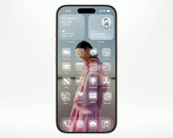 Jun 09, 2025
 Jun 08, 2025
 May 28, 2025
 May 22, 2025